
6 Popular Decor Trends Designers Are Already Retiring for 2026
Some design trends become classics, while others fizzle out fast. One minute, you think your entire apartment should be painted a moody green. Next, you’re wondering how you ever lived without a space swathed in shades of ivory. You go all in on scallops, then end up overdoing it like you did with chevron circa 2012.
What will those flash-in-the-pan moments be this year? Three designers shared their thoughts on which big 2026 trends may be all over social media at the moment but are headed towards a quick flameout.

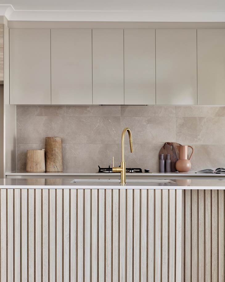
Fluted Millwork
Fluted millwork and furniture has been all the rage for a few years. From cabinet doors and kitchen islands to dressers and coffee table bases, fluted detailing has been a fun way to add texture to a piece. It’s a little bit mid-century, a little bit modern, and brings a lot of tactile detail. But, just like many popular motifs over the years, it has perhaps reached peak saturation at this point, say some designers.
“I am guilty of this one, as many designers were craving a different door front after the ‘everything Shaker’ trend. But I think fluted millwork has been overdone and doesn’t feel as timeless as a thin Shaker or flat-panel door front,” says Kellie Reynolds, principal and owner at Smith Reynolds Interiors. The solution here? Maybe don’t go with fluting for the more fixed features in your home — a kitchen island, or your cabinetry. But you can still add a fluted accent (or two) throughout your home for visual interest.

Cottagecore
Turns out many people’s favorite whimsical style might have an expiration date. “This is not a popular opinion — I know!” says Reynolds. “Cottagecore as a trend is so hot right now and, while I’m loving all the colors and patterns, I think it can be done on a more minimal level.”
She recommends interpreting the look in a way that feels a little more restrained and clean. Rather than have plates on the wall and ruffles and pleats on every piece of furniture, Reynolds suggests just choosing one or two pieces of cottagecore style decor to keep a space feeling uncluttered.

Beige Zellige Tile
Zelige tile has a hold on the design world at the moment. It feels organic and handcrafted. It has a storied past, yet it also looks fresh and light. But that also means it’s everywhere, and that’s often the barometer for a trend that’s gone too far.
“I know this might not be a popular take, and it is beautifully imperfect, but it’s everywhere right now,” says designer Terri Brien about zellige. “When something shows up that consistently, it starts to lose what made it special.”
While many designers might stand by the glossy yet rustic look of handmade zellige tile, Brien adds a final nail in the coffin, comparing it to one of the most ubiquitous trends of the mid-aughts. “Neutral zellige tile is beginning to feel a lot like the gray trend from years ago,” she adds. “Not that it’s bad — just very overdone.”

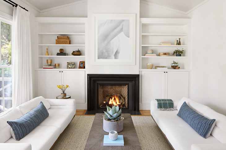
Curves
You might want to sit down for this one. Just don’t do it on a curvy sofa. Those bulbous, rounded, inviting silhouettes that have been feeling “oh so cool” are beginning to be “oh so trendy” — and not necessarily in a good way.
“Curves are still having their moment, but this is where I always tell people to be careful,” says Brien. “A little goes a long way. When everything is curved, furniture, cabinetry, doorways, it starts to feel like too much.”
She warns against using too many curves in one space. It’s not necessarily a singular curvy sofa that’s going to make your space feel passé; it’s using a trend en masse. “The more you lean into any one trend, the faster a space is going to feel dated. Keeping a balance is what gives a home longevity,” says Brien.

Neutral Tone-on-Tone Spaces
Neutral spaces — decorated top-to-bottom in calming shades of beige, greige, and ivory — feel elegant. They’re like a movie set, with every item perfectly selected to work within a monochromatic palette. Some designers, though, aren’t so sure that the tone-on-tone, neutral look works, particularly when you’re drawn towards spaces that feel vibrant and alive.
“As a concept, tonal monotony is tranquil and refined,” says Kanika Bakshi Khurana, principal interior designer and founder of Kanika Design. “But walking back into some of those rooms months later, there’s no denying that feeling of having an emotional flatline. When there’s nothing to add variation, it’s like the room is constantly living in this muddied hum.”

Post-Modernism
The bold patterns and bright colors of post-modernism feel fun right now — and they are! But that doesn’t mean they’re going to stick around for the long haul. Some of us have lived through this before, and know that trends are cyclical. Designer Courtney Blanton explains why you might not want to double down here, even if you’re attracted to bright shiny things and neotenic shapes.
“Post-modernism is having a major moment right now — splashes of color, fun shapes, cartoon-like furniture,” says Blanton. “It was popular before, and then it wasn’t. History has a way of repeating itself, and I just know this one has an expiration date.”
Design Defined
Never miss the style inspo and recommendations you crave with Design Defined. Follow along each week as our Home Director Danielle shares the best style advice, latest trends, and popular decor finds you just can't miss.