A Deeply Dramatic, Contemporary & Classic London Flat

Name: Jane Heath and Jeremy Walker and their son, Henry
Location: Gospel Oak near Hampstead Heath — London, UK
Size: 1,120 square feet
Years lived in: 18 months

Can't-Miss House Tours Straight to Your Inbox
Keep up with our latest house tours each weekday with our House Tour of the Day newsletter
When architects Jane Heath and Jeremy Walker first saw this late-Victorian flat, located just around the corner from Hampstead Heath, they were at once drawn to the layout and the sense of space and light. They were looking for a new family home following the arrival of their son, and so many of the flats they’d seen had been created by dividing up large houses, leading to spaces that were awkwardly arranged. Being purpose-built, however, this apartment was perfectly laid out, with well-proportioned rooms leading off a long central hallway and balconies at both front and back. Add to that the high ceilings, vast windows, and oak parquet floors, and Jane and Jeremy knew they’d found their home.
As architects, Jane and Jeremy are both naturally passionate about good design, although each has a quite different aesthetic—Jane is more inclined to the minimal and monochrome, while Jeremy leans towards bold colors and witty, quirky design. In their home, they’ve brought together their styles in an ongoing process of dialogue and compromise, with beautiful results.
Jane and Jeremy run architecture and design studio HeathWalkerStudio, and Jane shares her enthusiasm for interiors, materials, design heroes, and art (among other things) in her blog, owl’s house london.
Apartment Therapy Survey:
Our Style: Contemporary, classic, eclectic, quirky
Inspiration: We first took inspiration from the flat itself. For us, design is all about context, so working with what was already here was paramount. And we had some lovely proportions and features to start with. We also had to work with a lot of grey cabinetry! My passion is interiors, so I’m always poring over design blogs and magazines—Architectural Digest and World of Interiors, for example.
Favorite Element: The layout. The flat is within a mansion block, so it was built for purpose. With balconies front and back, there are lovely long views through, which is really important for a sense of space and light. We had spent 12 months looking for a flat and breathed a sigh of relief the moment we saw this one.
Biggest Challenge: Meeting of minds! Being designers, we both have a strong aesthetic—mine is minimal and monochrome, Jeremy’s is bold and vibrant color! So we’ve had to compromise.
We also moved from a one-bedroom flat to a four-bedroom one, and we decided to do without rather than buy things we didn’t love. So it’s still progressing.
What Friends Say: Can we come and stay?
Biggest Embarrassment: The living room is very much a work-in-progress… and both the layout and feel of the room are going to change quite dramatically. Watch this space!
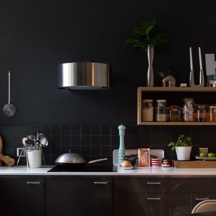
Proudest DIY: Birch ply open-fronted shelving units. We have them in the kitchen to display storage jars and in the study to hold folders. We have also designed a coat/hat rack in birch ply and a two-person desk. Apart from that, we are proud of any DIY we do, because as architects we usually have builders to do the dirty work!
Biggest Indulgence: Artwork. We have a beautiful photograph by our friend the artist Frances Kearney which is shot on the North Norfolk coast, a place we know well. Also an abstract painting by the Mid-century artist Gerard French, which is the first serious painting I ever bought. We have a number of other small pieces by friends including the Scottish artist John Behm.
Best Advice: Take time to get to know the place before you finalize the design; make sure you really understand how you will use the space, how the light works, what the real problems are. Spend money on a few key items (things you see and touch the most) and avoid designing around a current trend; pick things you love. Really make the most of what you have.
Dream Sources: 1st Dibs; Modern Shows for fabulous classic design and Mid-century pieces; the brocantes of Paris and concept store Merci; any fabrics from Dedar; and in London, Skandium and Absolute Flowers & Home in Maida Vale for gorgeous, one-off, unusual pieces.
Resources
PAINT & COLORS
- Kitchen, white: Farrow & Ball Cornforth White
- Kitchen, black: Farrow & Ball Dimity Off-Black
- Master bedroom: Sanderson Indigo Blue
- All other walls: Dulux 00E55
ENTRY
- Light bulbs: Plumen
- Stool: Artek 60 from twentytwentyone
- Hampers used as storage baskets: Fortnum & Mason
- Plywood stag head: Hurn & Hurn
- Frames: Habitat Aluminus
- Artwork: Untitled by Gerard French
LIVING ROOM
- Sofa: Stella in Graphite from sofa.com
- Bookcase: made by Jeremy using MDF, stainless steel marine cables, and polypropylene in 1986
- 1960s Lurashell Egg chair: antique shop
- Tulip side tables: Modern Shows
- Wall lamp: Kaiser Idell in Black via Etcetera Vintage
- Aluminum goose-neck floor lamp: antique shop
- Sofa cushions: Palmeral in Midnight/Green from House of Hackney
- Black-and-white cushion: covered in Dedar Tangram fabric
- Blanket used to cover ugly old armchair: IKEA Henny (discontinued)
- Artwork: Untitled I, 2009, Lambda C-Type print by Frances Kearney
KITCHEN
- Cupboards: IKEA Ringhult in High-Gloss Grey
- Quartz worktop: bespoke by Roann in a matte white finish
- PH5 pendant light: Twentieth Century Antiques
- Circular dining table: antique shop
- Birch ply shelving unit: designed by Jeremy
- Chair: Stokke Tripp Trapp from Skandium
- Tap: Blanco Alto
- Candlestick: Masterpieces 1087 by Georg Jensen
BEDROOM
- Pendant light: 1970s Verner Panton-style Perspex from Modern Shows
- Ercol Windsor chair: hand-me-down
- Dresser: Perouse from Habitat
- Tall boy drawer unit: Radius from Habitat
- Ornate framed mirror: hand-me-down
- 3-door cabinet: Kartell Componibili from Heal’s
- Jewelry bust: Georg Jensen
HENRY’S BEDROOM
- Bed: Muji
- Bedding: Kissing Robins (discontinued) from Anorak
- Blue metal star: antique shop
- 3-door cabinet: Kartell Componibili from Heal’s
- Clamp light: Tommy from Habitat
GUEST BEDROOM
- Bed: Tatsuma in Ash from Habitat
- 1930s Art Deco walnut bedside tables: Dorking House Antiques in Dorking
- Metal picture frames: Aluminus from Habitat
BATHROOM
- Washbasin: Vero from Duravit
- Toilet: Vero from Duravit
- Pendant light: Kartell FLY from Heal’s
- Blue glass bottles: vintage
- Succulents in hand-painted grey pots: Future and Found
STUDY
- Birch ply desk and shelving unit: designed by Jeremy
- Child’s desk: vintage
- Office chairs: Mirra from Herman Miller
- Chair: Panton Junior from Vitra
- Digital wall clock: 100 Object Mirrors of Silence Time, Daniel Weil, 1984 (manufactured by Jeremy for Parenthesis Ltd)
- Bookcase: IKEA Billy
Send us your own:
→ Share your home with Apartment Therapy: House Tour Submission Form
→ Are you a designer/architect/decorator? Share your residential project: Professional Submission Form.
→ And see all of our past house tours here
Updated daily with fresh tours full of photos for you to pin & enjoy!