Before and After: A Pretty Amazing Master Bath Remodel

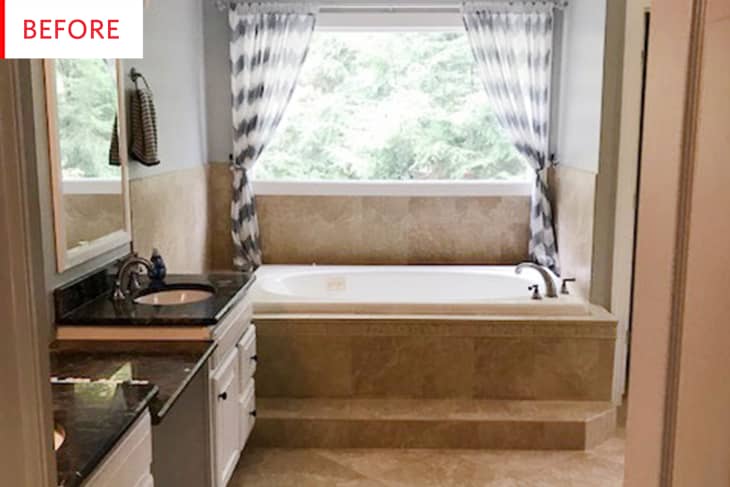
This bathroom window is amazing — just imagine gazing outside while in the tub! —but, unfortunately, it gets a bit lost in what the owner describes as an ultimate late-’80s/early-’90s bathroom: “Lots of beige, fancy flourishes and brown granite.” It will take a total gut job to bring this bathroom into the 21st Century.
Here’s a full-length shot of what Erin Wheeler of Sunny Circle Studio‘s bathroom, pre-renovation. It was totally practical, but definitely less than ideal, and after four years, Erin was ready for a change. At some point she had painted the walls a light grey, but that wasn’t enough to make her happy.
And what a change it is! This bathroom is so bright and inviting now. The white walls — which have plenty of interest of their own, thanks to the shiplap and the interesting tile pattern — act as a frame to the stunning window, making it the focus of the room, with the wood window frame as an actual frame. That tub is an absolute dream. It is beautiful as an object and also conjures up images of long, luxurious soaks.
The original shower is very nice: two showerheads for companionable — or especially indulgent solo — showers, and it’s much less claustrophobic than most shower stalls, yet not so large that the air remains freezing. Still, it is quite beige.
The new shower retains all of the great things, with the added benefits of storage cubbies (why weren’t there any before?!), stylish matte black hardware, and lovely light-reflecting tiles and marble. The interplay of that marble, hex tiles, and the herringbone subway tiles means that the overall look doesn’t read as just white and no one pattern or material dominates. As Erin describes it, “I love how everything feels bright and cool, but also warm and organic from all those hints of walnut and wood in the room.” All of the brass fixtures certainly add to the warmth.
I’m sure the black marble vanity top was the hottest thing ever when this house was built, but it doesn’t quite work with the other materials. With a black and white floor, the black countertop and white cabinetry could have worked, or maybe the black marble and brown tile floor could have made sense with rich wood cabinets. As it is, it feels like a bit of a hodgepodge.
I like all of this, but my favorite aspect is perhaps the combination of bar drawer pulls and hexagonal doorknobs. The two shapes play so well together, and the hexagons are perfect with the floor tile. I also appreciate that the paneled doors and flat drawers keep the whole look from being too fussy or flat, or from feeling stuck in one era.
Be sure to go to Sunny Circle Studio for more information about the three-month renovation process and all the resources.
Thank you, Sunny Circle Studio!